How to Read Stock Charts for Beginners
Learn how to read stock charts step by step. This beginner's guide covers candlestick patterns, volume, moving averages, and how to spot trends — with no finance background required.
Stock charts look complicated at first. Lines going up and down, colored bars, numbers on every axis. But once you understand what each element represents, reading a chart becomes second nature.
This guide breaks down exactly what you're looking at — and what it actually means for your investment decisions.
What Is a Stock Chart?
A stock chart is a visual representation of a stock's price history over time. At its most basic, it shows you one thing: what price people were willing to pay for a stock at any given moment.
That simple idea — price over time — is the foundation of everything else. Every indicator, every pattern, every line on the chart is derived from it.
Most charts you'll encounter show four pieces of data for each time period:
- Open — the price when the period started
- Close — the price when the period ended
- High — the highest price reached during the period
- Low — the lowest price reached during the period
These four numbers are called OHLC data, and they're the raw material for almost everything in technical analysis.
The Two Most Common Chart Types
Line Charts
A line chart connects closing prices across time. It's the simplest chart type — easy to read, easy to understand trends at a glance.
The downside: a line chart throws away information. You only see where the stock closed, not how wild the swings were during each period.
Best for: Getting a quick sense of long-term direction.
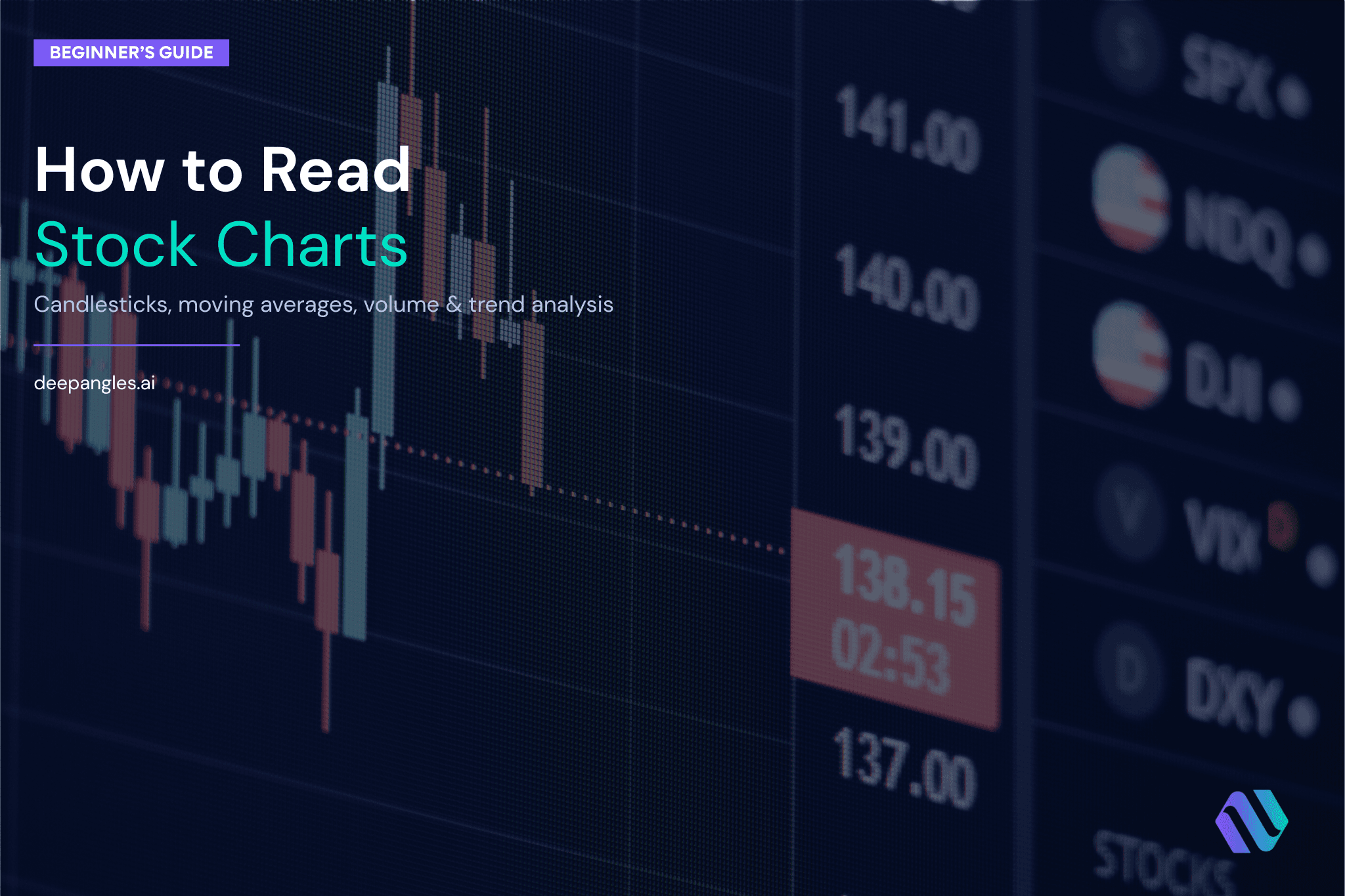
Candlestick Charts
Candlestick charts are what most serious investors use. Each "candle" shows all four data points — open, close, high, and low — for a single time period.
Here's how to read one candle:
- The body of the candle is the box between the open and close price
- The wicks (also called shadows) extend from the body to the high and low
- A green (or white) candle means the price closed higher than it opened — buyers were in control
- A red (or black) candle means the price closed lower than it opened — sellers were in control
Best for: Day-to-day analysis, spotting patterns, understanding price action.
Time Frames: What Are You Actually Looking At?
Every chart has a time frame — the period each bar or candle represents.
| Time Frame | Each Candle = | Best Used For |
|---|---|---|
| 1 minute | 1 minute of trading | Day traders |
| 1 hour | 1 hour of trading | Short-term traders |
| 1 day | One full trading day | Most investors |
| 1 week | One full trading week | Long-term investors |
| 1 month | One full month | Long-term trend analysis |
For most individual investors doing stock research — not active trading — the daily chart is your primary tool. The weekly chart is useful for stepping back and seeing the bigger picture.
How to Read a Price Trend
The most important thing a chart tells you is whether a stock is in an uptrend, downtrend, or moving sideways.
Uptrend
Price makes higher highs and higher lows over time. Each rally goes higher than the last, and each pullback stays above the previous pullback low. This is bullish — buyers are consistently stepping in.
Downtrend
Price makes lower highs and lower lows. Each bounce fades before reaching the previous high, and each decline breaks below the last low. Sellers are in control.
Sideways (Consolidation)
Price bounces between a clear ceiling (resistance) and a clear floor (support) without making meaningful progress in either direction. Often happens before a significant move.
Support and Resistance: The Two Most Useful Concepts
Support is a price level where buying interest tends to emerge — a floor that the stock has bounced off before.
Resistance is a price level where selling pressure tends to emerge — a ceiling the stock has struggled to break through.
Why do these levels matter? Because markets have memory. If a stock bounced at $50 three times over the past year, traders will watch that level again. That collective attention becomes self-fulfilling.
Practical rules:
- A stock approaching a support level might bounce — or break through
- If it breaks through support, that level often becomes new resistance
- If a stock breaks through resistance with strong volume, that's a bullish signal
Volume: The Most Overlooked Indicator
Volume is the number of shares traded in a given period. It appears as bars at the bottom of most charts.
Volume tells you how much conviction is behind a price move.
- High volume + rising price = strong buying interest, bullish
- High volume + falling price = strong selling pressure, bearish
- Low volume + rising price = weak move, potentially unsustainable
- Low volume + falling price = no panic selling, potentially just noise
The key rule: don't trust a breakout that happens on low volume. If a stock breaks above a key resistance level but volume is below average, the move is suspect.
Moving Averages: Smoothing Out the Noise
A moving average takes the average closing price over a set number of periods and plots it as a line on your chart. It smooths out the daily fluctuations so you can see the underlying trend more clearly.
The two most widely used moving averages:
50-day Moving Average (50 MA) Represents the average price over the past 50 trading days. A stock trading above its 50 MA is generally considered to be in a short-to-medium term uptrend.
200-day Moving Average (200 MA) Represents the average price over the past 200 trading days. This is the gold standard for long-term trend direction. Professional fund managers watch this line closely.
The Golden Cross and Death Cross
- Golden Cross: The 50 MA crosses above the 200 MA — historically a bullish signal
- Death Cross: The 50 MA crosses below the 200 MA — historically a bearish signal
These aren't perfect predictors, but they're widely watched, which means they often become self-fulfilling.
Relative Strength Index (RSI): Is a Stock Overbought or Oversold?
RSI is a momentum indicator that ranges from 0 to 100. It measures how fast and how much a stock's price has been moving.
- RSI above 70 = potentially overbought — the stock has moved up quickly and may be due for a pullback
- RSI below 30 = potentially oversold — the stock has fallen quickly and may be due for a bounce
- RSI around 50 = neutral momentum
Important caveat: in strong trends, stocks can stay overbought or oversold for a long time. An RSI of 75 doesn't automatically mean "sell" — in a strong bull market, RSI can stay elevated for months.
Putting It All Together: A Simple Chart-Reading Framework
When you look at a new stock chart, work through this checklist:
- Set the time frame — Start with the weekly chart for context, then drill into the daily chart
- Identify the trend — Is the stock making higher highs and higher lows, or lower highs and lower lows?
- Find key support and resistance levels — Where has price bounced or stalled before?
- Check the 50 and 200 MA — Is the stock above or below both? Which direction are they pointing?
- Look at recent volume — Does volume confirm the recent price movement?
- Check RSI — Any extreme readings that suggest overbought or oversold conditions?
This takes about two minutes once you've done it a few hundred times.
Charts Are One Piece of the Puzzle
Technical analysis — reading charts — tells you what a stock's price has been doing and what traders are thinking. It doesn't tell you whether the underlying business is good.
For a complete picture, you need to combine chart analysis with fundamental research: revenue growth, profit margins, competitive position, valuation. A stock can look great on a chart and still be a terrible investment if the business is deteriorating.
The best investors use both. Charts to understand price behavior and timing. Fundamentals to understand whether a stock is worth owning in the first place.
Frequently Asked Questions
What is the most important thing to look for on a stock chart? The trend. Before anything else, determine whether the stock is in an uptrend, downtrend, or sideways pattern. Everything else you analyze should be filtered through that context.
What is the difference between a candlestick chart and a bar chart? Both show the same OHLC data (open, high, low, close). Candlestick charts use a filled body to show the relationship between open and close, making patterns easier to spot visually. Most traders prefer candlestick charts.
How long does it take to learn to read stock charts? The basics — identifying trends, support/resistance, and moving averages — can be learned in a few hours. Developing an intuition for chart patterns takes months of practice and looking at hundreds of charts.
Should I use technical analysis or fundamental analysis? Both. Technical analysis tells you what price is doing and can help with timing. Fundamental analysis tells you whether the business is worth owning. Relying on only one approach leaves you with an incomplete picture.
What time frame should a beginner use? Start with the daily chart. It has enough detail to be useful without being noisy. Once you're comfortable, add the weekly chart for longer-term context.
Do stock charts work for all markets? Yes. The same principles apply to US stocks, Hong Kong stocks, Chinese mainland stocks, and crypto. Price is price — support, resistance, trends, and volume work the same way across markets.
DeepAngles provides multi-dimensional stock research across US equities, Hong Kong stocks, and Chinese mainland stocks — combining technical signals, fundamental scoring, sentiment analysis, and institutional research intelligence in one platform. Try it free →
Want to run your own analysis?
DeepAngles generates institutional-depth research reports in minutes.
Start Free